Yesterday, like many millions of people, I went to see “The Hobbit”. Visually it was a sumptuous feast. Nearly every shot looked like a finely executed painting. I didn’t like the storytelling as much. Peter Jackson seems to have become, to the principle of “Stretch this scene out as long as possible,” as Quentin Tarantino has become to “Ha ha, made you mad, didn’t I?” and Christopher Nolan to “Worship no other Gods before me!”
OK, that last was a slight exaggeration. No real god would be nearly as self-important as a Christopher Nolan film.
The whole time I was watching the stunning visuals of “The Hobbit” — the chiaroscuro lighting, detailed prosthetic makeup, camera angles, interiors, costumes — it all seemed incredibly familiar. And not because of the recent film trilogy, but because of something earlier.
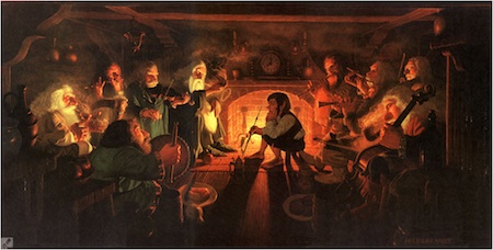
And then I had it! Some scenes from the current Hobbit film are precise visual echoes of the illustrations from the late nineteen seventies by the brothers Hildebrandt. For example, here, from their 1977 Tolkien calendar, is “The Unexpected Party”:

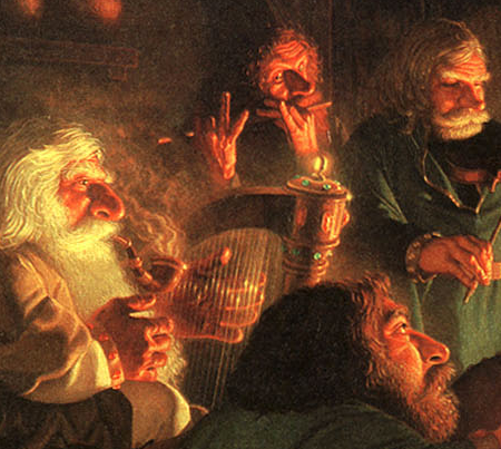
The lighting and composition form a perfect match to the corresponding scene in the just released movie. If you look at this close-up of the above illustration, you can practically see the actors jump off the page and into the film:

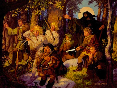
You can also see the Hildebrandts’ style at work in this illustration for “The Sword of Shannara”, also from 1977:

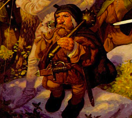
Again, here is a close-up — practically a lesson in what a “Peter Jackson dwarf” should look like:

After scouring the Web for info, I can’t seem to find any official connection between the brothers Hildebrandt and the film†. But of course Peter Jackson would have grown up with their illustrations in his head.
Now, you might protest: “But isn’t this just what Tolken’s world looks like?” And the answer is no. Until these illustrations came out, the Shire and its environs looked like many things (in illustrations by many artists, including Tolkien himself), but they did not look like this.
As far as I can tell, these two guys, Greg and Tim Hildebrandt, invented what we now think of as “what the inhabitants of Middle Earth look like”. And they did it so successfully that people seem to have forgotten that this was indeed an invention — one that did not exist until forty years after “The Hobbit” was first published in 1937.
†Jackson’s earlier trilogy borrows more heavily from the style of the illustrator John Howe, and the landscapes and cityscapes in all of the films are heavily influenced by the beautiful imagery of Alan Lee.
Neat. I had never seen these illustrations before. Did you happen to see the high framerate version?
This screening was not HFR. I’m wary of HFR because I remember once seeing a demonstration of Showscan (Douglas Trumbull’s 60 fps format), and feeling that all the magic had been drained from the screen by an annoying literalness.
If I have time, I might go and see The Hobbit again in HFR, just for comparison. Seeing the same film in both formats seems like the only way to really evaluate HFR fairly.