In a recent post I floated future display technologies in which text might appear to hover in the air between people. And I discussed a potential problem: if both people want to read that text from left-to-right (or from right-to-left, should they live in Tel Aviv), then their respective views of corresponding parts of a document will not line up.
Sharon pointed out that it might be asking too much to ask people to adapt to vertical text, and then Xiao commented that it would probably be a lot easier for China or Japan to adapt the idea of vertical text, since traditional Hanzu and Kanji are already written vertically.
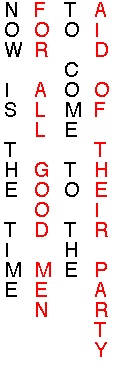
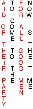
Not wanting our Western culture to fall hopelessly behind in future literacy, I played around with various fonts, and I discovered that an italic font works quite well for vertical text, since “slanted forward” in a horizontal orientation can also be read as “slanted backward” in a vertical orientation. The result is far easier to read than it is for non-italic fonts:
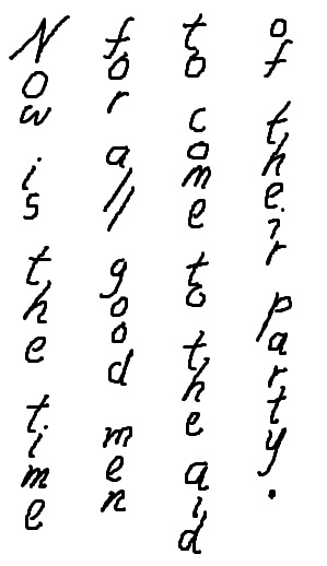
Each of the two conversants would see a different view of any individual letter, with every letter slanting to that person’s respective rightward direction. But the location of each letter in space would be the same for both conversants. Perhaps this combination of vertical orientation (and consequently, vertical kerning), with italic letters should be called a vertalic font.