Calling card

Today at the end of a large meeting a number of people were handing out calling cards. Most of the cards were crisp and new, but one colleague apologetically gave me one that looked rather worn and beaten up.

“I’ve had them for a while,” she explained, as I politely took the slightly frayed and faded card. As she handed it to me, she ruefully mused “The stories this card could tell.”

“One day,” I replied, almost reflexively, “they will.”

We both pondered that concept — the idea that some future tech will enable your calling card to contain entire narratives.

It’s a cool thought, but in a way a sad one. There is just something about that beaten up old card, given to me today by a slightly apologetic colleague, that is infinitely nicer.

Even more interactive diagrams

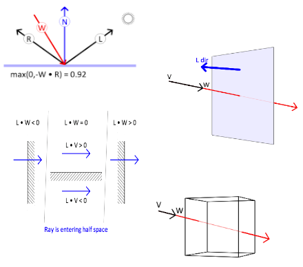
I’m really getting into the swing of things with these interactive diagrams. I’m starting to see several distinct categories of interaction emerge, and it’s getting gradually easier to create them, as I learn which common code I can put into libraries, to reuse across different diagrams.

Click on the image below to see my recently posted course notes with some more interactive diagrams:


Connected components

I’m starting to sketch out an idea for a collaborative web project. It’s still a bit vague, but here’s the basic idea:

You go to a web page and you see that it is divided into little squares. In each square some activity is happening, and this activity can affect that square’s neighboring squares. For example, one square might eject a red ball or squirt some paint to its right, and the next square over then does something in response to that.

Here’s the thing: Each of these squares can be authored by anybody in the community. Each author is working with the same API, which ensures that objects and actions can cross boundaries. But other than that, everything is up for grabs.

For example, an author might implement their little square to use some sort of crowd sourcing — what it does depends on stock market prices, or on how many people click YES or NO in some on-line game (which could be written just for this purpose), or with other instances of itself on other web pages.

There can even be wild-card actions. For example, a square might respond to something by swapping its position on the page with one of its neighbors. In this way squares might even be programmed to travel around the page, finding friends.

Any square you author becomes available to everyone else in the community as a component in a kit, so people can create their own web pages by snapping a few (or a lot) together in some novel way, and seeing what happens.

I’m starting to play with prototypes in HTML5, so that this can run everywhere. I’d be happy if someone wanted to collaborate. 🙂

Bits of inspiration

When I was a kid I remember being completely fascinated by binary arithmetic, from the very first moment I found out about it. I think at first I saw it as a secret source of power.

I had already been into cyphers, letter substitution codes, and that sort of thing. I remember when I was about eleven years old I wrote a letter in invisible ink, mostly made from lemon juice. The writing was completely invisible until you held it above a candle (cue spooky music here), at which point it would slowly reveal itself.

But binary numbers were something more. In a way they were a personal evolution for me, a transition from “I can do something nobody else can”, to “I can do something amazingly powerful and beautiful.”

I think it was the “beautiful” part that changed everything. The fact that I could use such a simple and elegant system to represent and combine numbers (a much more elegant system than our own base 10, I might add), was perhaps the first real tug at my heart strings toward the beauty of mathematics.

Now here I am, all these years later, programming computers every day, creating art with math, and having a hell of a time. All because of some ones and zeros. I don’t regret any of it — not one bit.

These beautiful blazing comets

I have gotten into the dubious habit recently of watching sequences of movies that trace out the careers of particular actors, from their earliest roles to their latest (and in some cases, their last).

It’s a fascinating enterprise, because you end up seeing two opposite things at once. Of course you see the unstoppable march of time, of cultural change, of shifting values, and alas, of mortality. But you also see the integrity, the majesty, of these beautiful blazing comets we call lives.

There is something wonderful about recognizing, even within young child actors, the unique spark that they will carry within their being for decades to come. It’s all there right at the start, that essential fire, although it will take many forms through the years.

In particular, today I reached all the way back to the very first film performance by Adam Arkin, the 1969 Academy Award winning short film “People Soup”, written and directed by his father, the great Alan Arkin (who had originally written it as a short story).

I had read the story many years ago, and had immediately fallen in love with it. I had known there was a film as well, but had not seen it until today. To my eyes, it is quite startling to see the twelve year old Adam Arkin in this, because everything that is essential in the man is completely there in the child. The film is also really funny. 🙂

But you can judge for yourself: Here is the film.

Principles for interactive diagrams

Looking at the interactive diagrams I have been making, I have begun to see specific principles emerge. These principles did not emerge because I went into the project with any specific principles in mind.

Rather, I had treated each diagram as its own specific design problem, separate from the others. Yet when I look at these diagrams in the aggregate, I see patterns.

For example, each diagram conveys only a single idea. I don’t try to tell multiple stories with a diagram. Rather, I tell multiple stories with multiple diagrams. As a consequence, each diagram corresponds to at most a few short paragraphs of text.

Also, I tend to use an “up to down” mouse movement to advance a kind of narrative. The general idea is “When the mouse is near the top of the diagram, the transformation that tells the story hasn’t happened yet. As the mouse sweeps down, the transformation takes place.”

This is consistent with thinking of a document as having a generally forward progression of thought. As the user moves the mouse down through the document, the resulting animation in each diagram advances the story a little bit.

When showing something that’s 3D, I tend to use horizontal mouse movement as a kind of lazy-susan effect, rotating the view about a vertical axis. This doesn’t give general viewpoints, but it’s good enough to give an intuition about the 3D shapes in the figure.

There may be other principles at work that I’m not thinking of. I suspect those principles will become easier to see as more of these diagrams get made.

Beyond the bounds of visible light

The subject of seeing unusual colors reminds me of a project I’ve wanted to do for years. Alas, it’s the sort of project that requires specialized equipment, and one would need to really be committed to do it properly. Here’s the gist of it:

Given that the human mind is capable of extraordinary feats of perceptual remapping and interpretation, it is plausible that we could map a wider spectrum into a narrower one. Specifically, suppose we set up three cameras: one that sees in infrared, another that sees in R,G,B, and a third that sees in ultraviolet.

Then we remap the resulting five-band image into a narrower spectrum: Infrared becomes red, red becomes orange/yellow, blue becomes cyan, and ultraviolet becomes violet.

Clearly information will be lost in the course of chromatic compression. But will our brains compensate? Will we be able to use our higher level knowledge of the world to perceptually reconstruct the full R,G,B portion of the spectrum in our minds, thereby freeing us to “see” the infrared and ultraviolet bands?

If so, this would be a way for people to see beyond the bounds of visible light.

Pure green

The second of my interactive diagrams from yesterday showed how the three types of color receptors in the human eye respond to different wavelengths of light. These three kinds of cone-shaped cells detect, respectively, short, medium and long wavelengths, and so they are called S-cones, M-cones and L-cones.

One look at the diagram and it’s clear that light is never detected only by M-cones. What we think of as green light actually triggers both M-cones and L-cones. It just triggers the M-cones a little more strongly.

So of course I started to wonder what it would look like if only your M-cones were triggered. This would be a kind of “pure green” light that no human being has ever seen. Would it look like a completely new color?

The only way I can think of to do this would be to shine a very finely patterned light at your eye, with bright dots placed exactly where the M-cones are, but avoiding the L-cones.

To make this work you would need a high speed eye tracker that measures the slight movements of the eye, and continually moves the pattern of dots to match this movement. This would ensure that each dot illuminates only an M-cone, not an L-cone.

But how small do the dots need to be? Well, one degree of visual angle is about 0.3mm on your retina. And each M-cone near the center of the retina is about 1um across, which means you’d need a dot that subtended about 1/300 of a degree in visual angle.

The biggest problem I can foresee is that people can’t easily focus an image to such fine detail. To get around this problem, the first thing I would try is to use a laser to send the image into the eye through the center of the pupil, where the eye’s lens has little effect on depth of focus.

It would take a lot of engineering to get this all working. On the other hand, it would be cool to see a new color that nobody has ever seen before.

More interactive diagrams

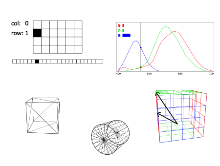
I had so much fun making interactive diagrams from my second computer graphics lecture of this semester, that this afternoon I decided to go back to my first lecture and make interactive diagrams of some of those topics as well.

If you click the image below, you get taken to a course notes page complete with interactive diagrams. One thing I’ve observed about these diagrams is that they are not just variations of a theme. Every diagram has a unique semantics, its own way of telling its story. I guess this is a kind of visual creative writing.

James Turrell and Nellie McKay

Today I went with friends to the Guggenheim to see the James Turrell show. The massive site-specific sculpture which dominates the rotunda is magnificent, a thing of wonder and beauty, well worth the very long line to get into the museum.

But then, we were told, there was another piece up on the fifth floor. When we got there we found an even longer line. The wait was well over an hour. Fortunately my friends were great company, and we had a wonderful time hanging out as the line slowly inched forward.

When we finally got to the room (where they let only 12 people in at a time) we were confronted by — how shall I say this — nothing.

I mean quite literally nothing. A bare room with nothing but a featureless gray rectangle painted on the wall. A complete absence of anything at all.

It was fascinating: Here were thousands of sophisticated New Yorkers, each waiting patiently for more than an hour, just to get a momentary peek at the Emperor’s extremely invisible new clothes.

I found myself wondering what everyone else might be thinking after having gone through the experience. Do people even realize that they have waited over an hour for the privilege of experiencing absolutely nothing? Or does reflexive worship of “high art” coerce everyone into pretending that they had actually seen something?

Then this evening I went with a friend to see Nellie McKay in concert, and it was quite the opposite experience. Ms. McKay is not only brilliant and talented, and at the very top of her game, but she is also incredibly generous with her art. A Nellie McKay concert overflows with joyful and intelligent musical and lyrical pleasures.

Maybe this is because it is pop culture — low art. Had this been a high art concert, perhaps audience members would have been asked to sit in total silence, and pretend that they had actually heard music.

Oh wait. John Cage already did that.