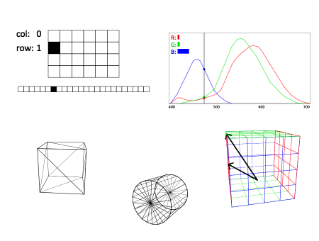
I had so much fun making interactive diagrams from my second computer graphics lecture of this semester, that this afternoon I decided to go back to my first lecture and make interactive diagrams of some of those topics as well.
If you click the image below, you get taken to a course notes page complete with interactive diagrams. One thing I’ve observed about these diagrams is that they are not just variations of a theme. Every diagram has a unique semantics, its own way of telling its story. I guess this is a kind of visual creative writing.
These are fantastic. It’s amazing how even a little bit of animation & color really helps understanding these concepts. I recall a SIGGRAPH lecture many years ago, when somebody showed a quick animation of how a Bezier curve is drawn as a result of repeated linear interpolations. You could almost see the whole auditorium flash as the light over every attendee’s head came on.
By the way, thanks to YouTube, a lot of Jim Blinn’s animated illustrations for the Mechanical Universe are online.
All fantastic!
One thing I want to see is the current indicating color of the How humans see colors diagram.