3D computer graphics is a great way to make things look real. After all, the techniques under the hood are basically simulating the physics of how real cameras capture real life: the shapes of objects, how a camera moves around a scene, the way light shines on surfaces. But there can be such a thing as being too realistic.
That’s one of the problems we were fighting in our Wild Things test. Here we had all of this fancy computer software that we had painstakingly tuned to convince people they were looking at reality, and now what we wanted was to convince people they were looking into a magical storybook. Not the same thing at all.
Fortunately, we had learned while making TRON that when you’re combining computer graphics with other things (like Jeff Bridges in a weirdly glowing spandex unitard), the trick is to modify the look of everything, so that it all meets in the middle. In the case of TRON the live action footage of the actors was deliberately given an eerie grainy look, and made to look hand-tinted – like something out of Fritz Lang’s “Metropolis” – and this same processing was done to the computer graphics backgrounds.
That, together with the “everything has red or blue glowing lines” motif, was very effective in marrying the foreground actors to the background computer graphics. The cranked-up graininess and stylized color palette masked any differences between computer graphics and physical props, and made you believe you were looking into some sort of consistently strange alternate universe – very different from the brightly lit, almost clinical, look of the scenes in TRON that were located in the “real” world outside the computer.
For Wild Things we were going for a very different look, but the principle was the same: marry foreground and background by visually stylizing both the computer graphics and the hand-drawn animated characters in a mutually consistent way. Today I’m going to talk about how we made the computer graphics backgrounds look like something out of a storybook. Then tomorrow I’ll talk about how we made the animated characters look like they were three dimensional.
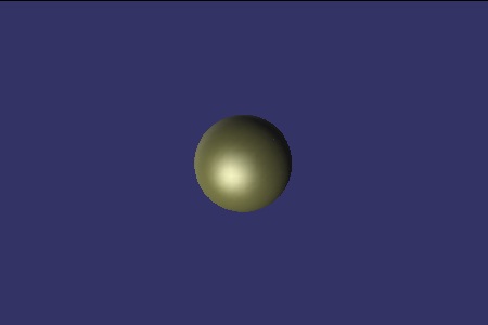
When you look at a real object lit by a light source, you immediately see that the light only directly affects the portion of the object that faces the light. The portion of the object that faces away from the light source remains dark. So generally cinematic lighting revolves around using a bright light in the front (the “key light”) to highlight the roundness of each shape, and a softer backlight (the “fill light”) to give definition to the shape’s silhouette. Using such a technique, the bedknobs on Max’s bed might have looked something like this:

That looks very nice, but it doesn’t look particularly magical. When you look at Maurice Sendak’s drawing style, you eventually realize that he had a wonderful trick of keeping you a bit confused about where the light comes from. In his drawings, light seems to come from everywhere and nowhere all at the same time. So to make this test, I modified our shading system in several ways. For one thing, I changed it so that the highlight on an object didn’t need to be in the right place. You could make an object brighter on the left, while having the highlight seem to come from the right.
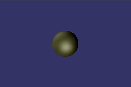
I also added an option to change the way objects in our 3D system react to light. Instead of only the part facing the light source getting brighter, I rigged it so that the light could seem to “wrap around” the object, bathing it in a softer light. This made the objects seem to glow a bit, like they do in Sendak’s illustrations. Finally, to capture the deliciously ominous feeling of the deep shadows Sendak adds to his illustrations, I added a feature that’s really impossible in reality – lights that can make things darker, instead of brighter. Using all of these techniques together, you could literally paint objects with light. So the bedknob on Max’s bed ended up looking more like this:

The difference is subtle but essential. The first bedknob looks like a simple but plausible 3D object. The second bedknob looks both real and not real, all at the same time. When an entire room is lit this way, the result looks not so much like a real place, but rather like an imagined idea of a real place. In other words, like the storybook version.
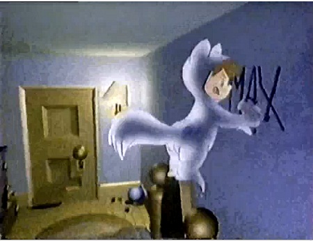
Here is a frame from the final test. With these lighting and shading tricks in place, the 3D scene seems to be slightly surreal, with a sense of drama and otherworldliness that would be hard to achieve using “physically correct” lighting:

The question still remained of how to take Glen Keane’s wonderful drawings of Max and the dog – which were really just pencil lines on paper – and make them appear to be rounded and three dimensional, so that they would look like they belonged together with the 3D backgrounds. And of course there was the little problem of how to make these pencil drawings cast believable shadows into a computer graphic scene.
Good topics for tomorrow!
I’m curious: How much easier was it to reproduce the above bedknob test images, compared to the work that went into finding the right combination of shader effects the first time around?
Thanks for writing this. So whenever I try to start a sentence with the words:”This is not about doing things physically correct…”, I will go back to your post….
Good question Ashley.
The first time around I recall there was about a week or so of experimenting with all sorts of ideas before coming up with a look that (1) conveyed the sense of being in a storybook world, and (2) was aesthetically consistent with the rounding technique used for the animated characters.
Reproducing the bedknob took me only a few minutes yesterday, since I already knew exactly what I was going for, and it was just a matter of implementing a shader.