The word “font” derives from the old days, when printing was done with real metal pieces that were used to press ink onto paper. A font was a complete set of such pieces that shared a particular weight, size and style.
For a given font, the letter “A” always looked the same, as did the letters “B”, “C” and so forth. And this is essentially still true today, in the computer age. When printing with a given font, a particular character always appears the same.
Consider, for example, the following word in my new line font:
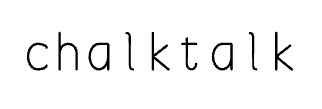
In the word “chalktalk” above, the letters “a”, “l” and “k” each appear twice, in each case without any variation. This is part of the definition of a font: The appearance of any printable character is completely determined. This is in contrast to, say, handwritten text, in which characters look somewhat different every time they are written.
But sometimes I want text in my Chalktalk system to have a casual handwritten quality. Because this is a procedurally defined font, I can just add noise to make that happen:
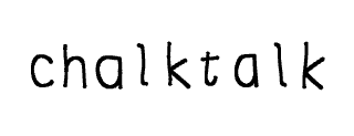
Now any given letter, such as the “a”, “l” and “k” above, will look somewhat different every time it appears. Which means that this is no longer a font — it violates the very definition of a font.
Yet it is recognizable. The statistical average of all occurances of any given letter converges to the original line font, even though no letter is actually in that font. And although this is not a font, we perceive it much the way we would perceive a font.
I guess you could call it an unfont.
Well, this is very, very Ken like, a procedural unfont. Love it.
Hmm, even with the noise the ‘c’ is behaving itself now?
Actually that was a typo in my code. Thanks for catching it! I’ve made lots of improvements to the font since this post.