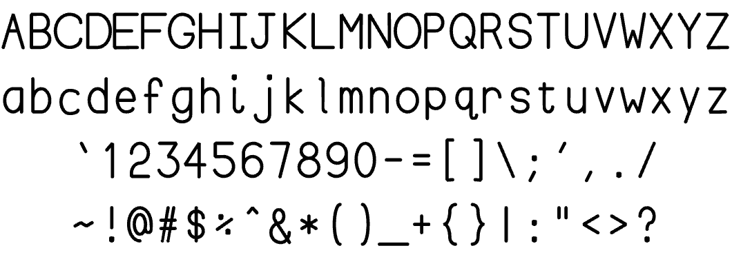
The reason I was thinking about fonts yesterday was that this week I designed my own font. I needed it because I am moving my Chalktalk interactive drawing program into VR, so I need text that can be “drawn in 3D space” like any other drawing.
I couldn’t use the standard font design tools, because those tools don’t let you create characters that can be drawn as lines and curves in space. So I wrote my own font design software, which actually only took about an hour (it’s a lot easier if you’re only going to design a single font). The design of the font itself was really fun, and took a few hours, mostly because I really got into the stylistic details.
Fonts are like chess sets — all of the characters need to “feel” like they belong together. You’re basically asserting a coherent design space, and all of the characters in that space need to play well together, so that they reaffirm each other aesthetically. But some of them also need to be just a little bit cheeky and impertinent.
Below is what I have so far. I’ve already switched Chalktalk over to use this new font, and it looks a lot better than the off-the-shelf one I was using before:
And here’s something I wasn’t able to do with my off-the-shelf font — let people walk around text in virtual reality, like any other object in the 3D shared virtual world. And that’s the real payoff!
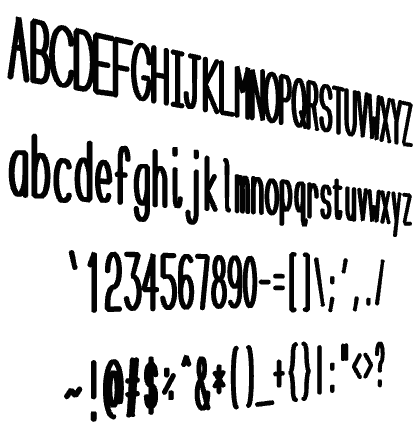
Cool! Um, but that lower-case ‘c’…just nudge it up a little…yeah.
The ‘c’ is being a just a bit cheeky and impertinent character — and so are you. 🙂