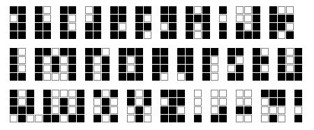
Thanks for all of the thoughtful comments on my Forever font post. For those who requested it, here is the font in an easy to transcribe form:
The font can also, by the way, be helpful for displaying a reasonable amount of text on a very low resolution screen, so it might find use in very low cost or low power display devices, such as a future smartphone designed to cost less than ten dollars, which would be useful in large parts of the world where today’s smartphones are unaffordable. If every kid has a smartphone, the challenges of attaining universal literacy can be approached in new and creative ways.
But let’s talk about those future people, the ones who might not even have the concept of electricity. The other day my colleague Murphy Stein and I were discussing the underlying challenge of developing modern technology specifically for the purpose of transmitting knowledge to fellow humans in a less technologically advanced future. We found ourselves circling back to the asymmetry between producer and consumer — what advanced knowledge artifacts might we produce here in the present to compensate for the limits on how those artifacts can be consumed in the future?
Ideally we wanted to do better than the information density of paper, but not rely on the rediscovery of the magnifying glass. One idea we came up with is to embed many different pages on each sheet of paper, so that you would see a different page as you looked at the paper from different directions. No magnifying glass required.
There are various ways of doing this. One way is to use scratch holograms — since these can be illuminated by the Sun (the one light source we can assume future humans will be able to access). They are also less fragile than regular holograms. One can also use Benton holograms (those rainbow holograms you see on credit cards), although these can only encode different images in one angular dimension, which seriously limits the number of different page images you could practically embed into one sheet.
Another possibility is to use integral imaging, the brainchild of Gabriel Lippmann back in 1908. In this approach, each page would be covered with many thousands of tiny plastic hemispherical lenslets. Looking through one lenslet from any given angle you can only see a tiny, highly magnified, speck of the underlying paper. If there is ink at that spot, the entire lenslet will appear black, otherwise the lenslet will appear white. If you print the right pattern behind the array of lenslets, then one piece of paper could contain a hundred different pages of text, each appearing when viewed from a particular angle (say, ten choices of view angle in each of the horizontal and vertical directions), as an array of visible black and white dots.
This last approach is particularly well matched to the Forever font. When you look at an integral image you see patterns of discrete dots — exactly the right sort of display on which to read the Forever font.
I just have to say that after recently reading Lynne Truss’ “Eats, Shoots and Leaves” I’ve developed a healthy respect for the highly overworked and (sometimes) unappreciated system of English punctuation.
Perhaps you didn’t include the semi-colon, the colon, the single- and double-quotes and the ampersand in the above example for expedience. However, if you haven’t developed their Forever Font analogs yet, consider adding them for the punctuation conscious among us, and – hopefully! – for those among “future people.” 🙂
Alas, it seems the very fate of future civilization lies within my colon. 🙂
I’m just wondering… on the one side there’s an assumption that the magnifying lens may not be re-invented again… on the other hand, that what we consider the visible spectrum will still be the visible spectrum.
Or is that part covered as well?
P.S. The Y is missing two bits – or half a nibble 😉
If the visible spectrum changes, then I’m pretty sure we’re no longer talking about human readers.
Thanks for catching that error in the Y. It’s fixed now.
I made a human readable caseless font in 3×3 squares. I’ll bet if you drew it out, you’d have the same exact results I had.
Lion: Please share! I can’t figure out how to make a human-readable font in 3×3 squares. I get stuck on a number of letters, including E, G and W. I would love to see what it looks like!!