Today I became curious to know whether the tiny font I made a while back could support different font styles. It’s a useful thing to determine, because as far as I know this font is the smallest readable screen font.
By the way, if you’ve been a grownup for a while (he said oh so diplomatically), you might want to wear reading glasses for what follows. 🙂
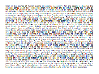
As a base comparison for the following discussion, here is my standard benchmark test — the first 515 words of the U.S. Declaration of Independence on a 320×240 screen, with enough room left over for a comfortable margin all around:

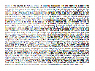
As a test I added bold and italic styles. In the following screen shot, all of the characters on the right half of the screen are in bold, and all of the characters on the bottom half of the screen are in italic (so the bottom right quadrant is all in bold-italic):

It seems to work just great! Nicely enough, I didn’t even need to make the bold characters take up more room than the non-bold characters. As you can see, the words all remain at their original locations on the screen.
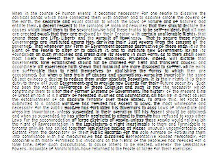
I also realized that with a font this small, it might be interesting to embed visual messages — or even animations — within the relative boldness of each character on the page. This could lead to a new kind of art form.
For example, in the below version of the U.S. Declaration of Independence, a shadowy figure appears to loom mysteriously over the document, perhaps subtlely shifting its significance into directions unforeseen by our Nation’s founders:

In a way this image is sort of funny. As long as you don’t, um, think about it too much. 🙂
This is really awesome and you are evil for showing this off but not allowing people to download it, even if it required pay. I need to create a cheat sheet for an exam tomorrow and would love to use your font…..but no. 🙁
I’ve been waiting and waiting and still no tiny font from you. I want it for my miniatures. Are you ever going to release it?
This may be unique in the PC world, but it’s been done in retro computers. LCD Fonts, 8 bit home computer fonts for 80 column terminals. I’ve made one myself that was 3×5 pixels. There’s only a few possible approaches to some letters, and he’s stumbled upon some of the good ones. I used a new idea in mine that made it more readable thought. I used 4 pixels wide for some letters to make them more readable, but that means a space might be missing sometimes, however practically it was always readable.
Some 8bit fonts here
https://damieng.com/blog/2011/02/20/typography-in-8-bits-system-fonts
oldsk001: I think I am the “he” in your comment. 🙂 Thanks for the link! I made that particular tinyfont quite a few years ago, and it makes specific use of the striped RGB pattern of the LCD displays at the time. Now I think I would focus more on the various RGB patterns for smart phones. For example, the Android Galaxy Note 4 (the one I use) has a fine diamond arrangement for the green elements interspersed with half as frequent red and blue elements. For that phone, making a green font that optimized just for the green diamond pattern might be a good strategy.
If you are interested in a tiny font to download, I propose you the one I did: Miniwi, that can make 80 characters fit on a 320 px wide screen.
I find it quite readable enough.
https://github.com/sshbio/miniwi