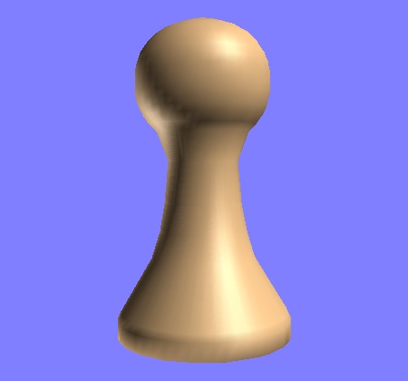
In order to build different chess set “fonts”, first we need to understand what are the different visual parts of a chess piece.
Today I deconstructed the virtual pawn I had yesterday constructed, and I discovered that the pawn has five distinct such parts. For want of better words, these might be called (moving from bottom to top) the base, skirt, stem, collar and head.
The image below shows the pawn with skirt and collar missing. If you click on the image, you are taken to a Java applet that allows you to remove and replace each of the pawn’s five visual parts.
Variation in chess fonts is going to largely come down to making sure that corresponding parts are varied consistently for every piece. For example, changing the skirt of the pawn should produce a corresponding change in the skirt of the bishop.

I also think “The Protean Pawn” would make a hell of a great name for a bar. 🙂
I was watching the SIGGRAPH papers demo reel for this year. It seems like the Stanford “fleet of jet planes” paper might apply to this problem?
(A Probabilistic Model for Component-Based Shape Synthesis)
I remember in the ’90s there was work on “multiple master” fonts, where you could tweak various parameters to generate new font styles on the fly, but it seems to have fizzled.